
Skeleton
The re-branding of a video production company.


Overview
Skeleton is the brainchild of Jonathan English and James Bryant — two brand-obsessed video enthusiasts who met at the University of Nottingham. They work across five continents and boasts a portfolio of leading, brave, playful brands that are eager to leave the average behind and embrace the remarkable.
Project scope
Brand Identity Workshop
Custom Logo
Animation
Associated Type & Colours
Custom Logo
Animation
Associated Type & Colours
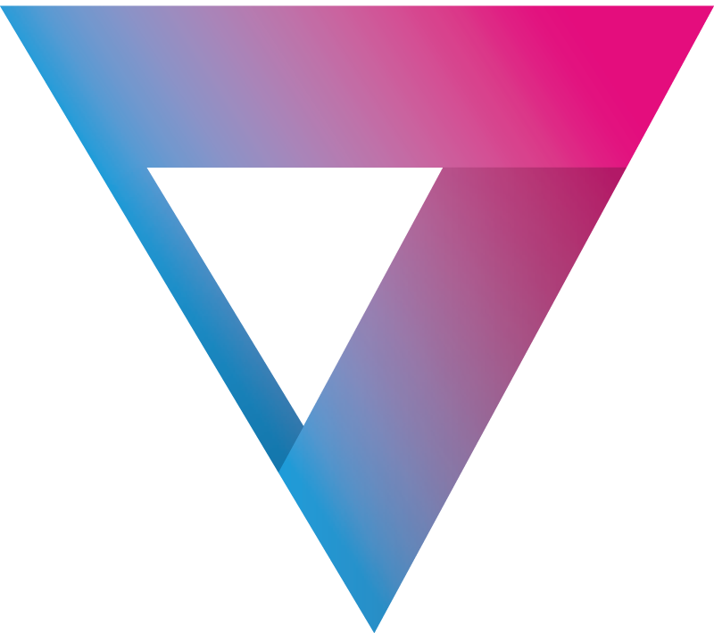
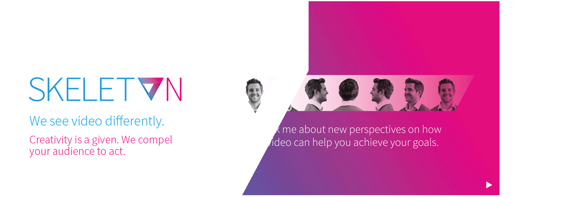
The idea behind the ident was a take on the classic play button. This was then angled upwards to help give a sense of positivity and forward motion. Vibrant graduation colours were then used to enhance the feeling of motion and energy. Depth and a feeling of knowledge and experience are shown via the use of shadowing at the angled points.
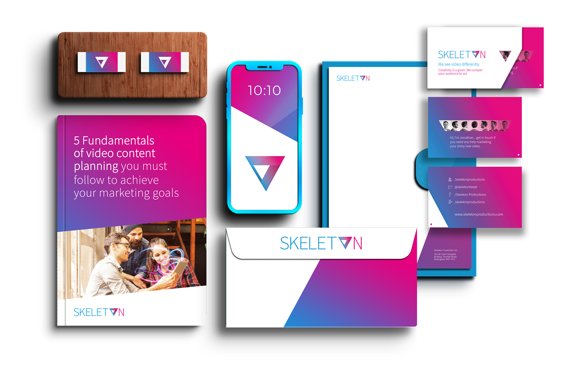

The graphics used to help house images and all plays from the main ident and the use of angles. This helps reaffirm the brand but also the feeling of movement and progression.

The theme with the main images was to use graphical swirls to help represent the content that has you transfixed. These swirls were on brand with the main colours of magenta and cyan.


For the business card I used the idea of a zoetrope for a play on the idea of video when the card is slid in and out of its sleeve.

"The one difference is that Ben delivers the same high levels of service found in the most respected London agencies, but without the huge price tag! As well as this and from a creative point of view, I will certainly continue to recommend him."
Jonathan English
Skeleton
